TeamSupport: Unifying four B2B support products into one scalable design system

- Client
- TeamSupport
- Role
- Product Designer (UX/UI)
- Timeline
- 2022 to 2023
- Tools
- Figma, Noodl
TeamSupport is a B2B customer support platform for ticketing and live chat. After merging with SnapEngage and going through a rebrand, the company was running four separate products, each with its own look and behavior. I worked at TeamSupport for five years as a product designer, and in this project I helped turn those four products into one consistent experience, built on UX research and a scalable design system documented in Figma.
The challenge: four products, no shared language
Support teams switched between tickets, live chats and customer data all day, but each part of the platform felt like a different product. Every new feature added more inconsistency, and the design team had no shared foundation to build on.
UI audit: 250+ colors and 10+ font families
We started with a full audit of the existing interfaces. It showed a fragmented, chaotic landscape:
- 250+ colors in use across the products.
- 10+ font families, used inconsistently.
- Mixed UX patterns: the same task worked differently depending on where you were.
The audit made it clear that patching screens one by one wouldn't work. We needed a structured, system-driven approach to unify the experience and give the product a scalable foundation.
From brand values to product design principles
An external design team had redefined the company's identity around three values: Trusted, Sophisticated & Genuine, and Attentive & Adaptable. We translated them into three principles the product team could design against:
- Secure & predictable. Familiar patterns and a cohesive design system. Data is safely stored and HIPAA-compliant, UI complexity is reduced through consistent components, and clear system feedback means users always know where they are and what happens next.
- Mature. A calm, sophisticated interface that puts clarity over decoration: neutral, darker tones instead of visual noise, minimal embellishment, sharp edges and intentional white space.
- Flexible & customizable. The interface adapts to different workflows, preferences and accessibility needs: table or list views, column visibility, sizing, themes, contrast modes and font sizes.
User research: one platform, many roles
The research covered a diverse group of professionals, from frontline agents handling high volumes of tickets and chats to managers and directors tracking performance and strategy.
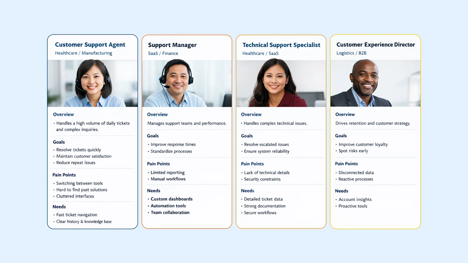
Their responsibilities were different, but their needs overlapped: efficiency, clarity and control. Whether they were solving a complex technical issue or monitoring customer health, they all needed a system that is predictable, flexible and low-friction, with consistent behavior, room to customize and clear feedback.
Navigation first: wireframes and user testing
Before defining any visual style, we iterated on the UX, focusing on layout and on how users move between tickets, chats, or both at once. Because the product supports many roles and permission levels, we explored several navigation structures using quick wireframes.
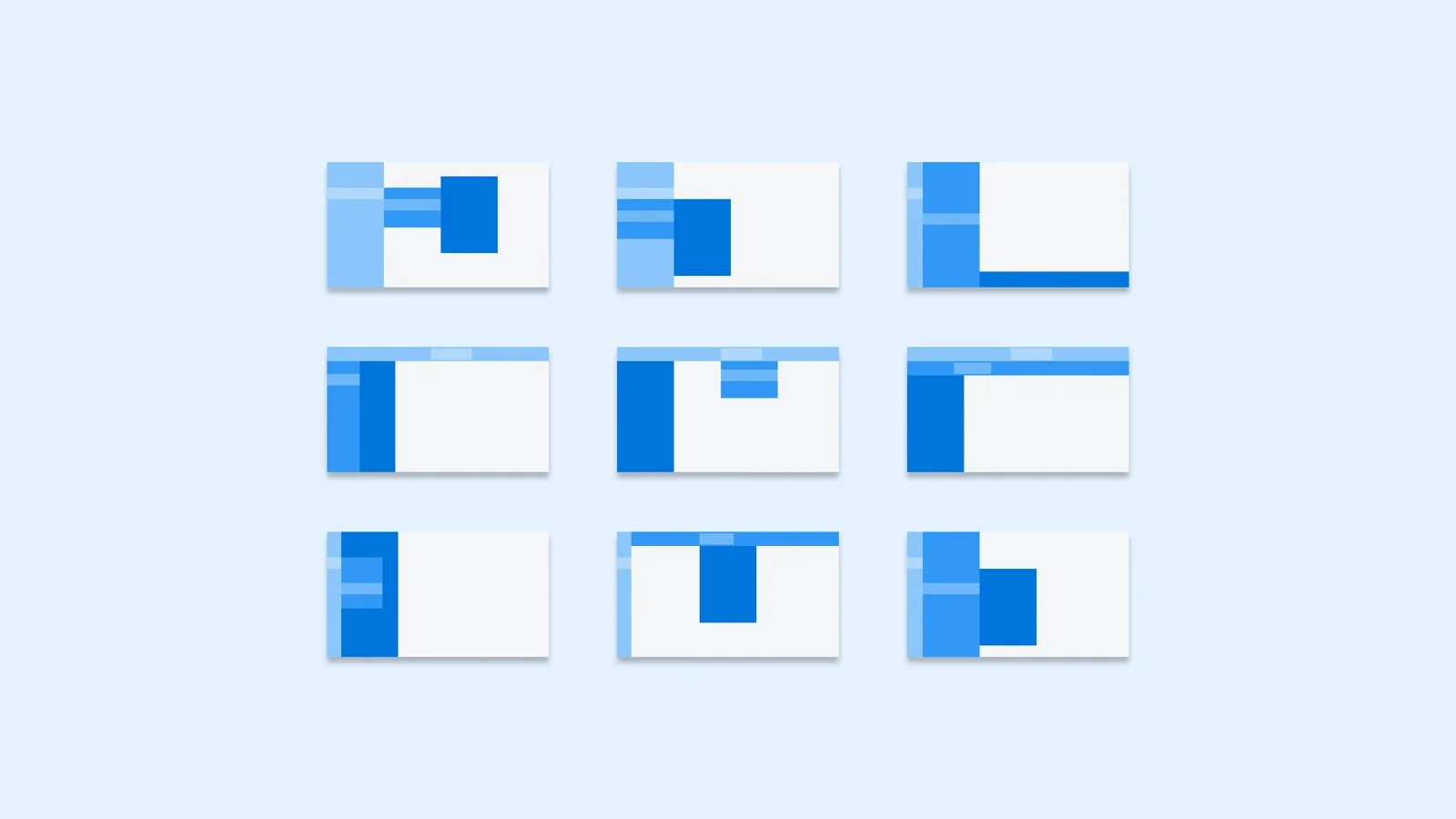
We validated each direction with user testing, checking our assumptions against real behavior. Along the way we reduced the number of UX patterns, making the experience more consistent and predictable.
Design tokens: a naming system everyone can read
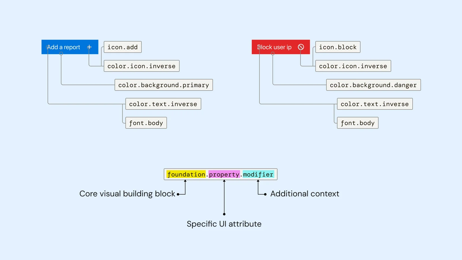
The design system uses semantic design tokens named as foundation.property.modifier:
- Foundation: the core building blocks, such as color, typography, icons and spacing.
- Property: the UI attribute the token applies to, such as background, text, border or icon.
- Modifier: the purpose or role, such as primary, inverse or danger.
So a destructive button reads as color.background.danger with color.text.inverse, and anyone on the team can tell what a token is for just from its name.
Accessible, modular components
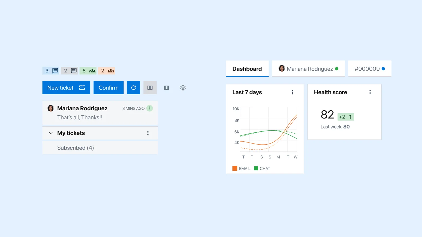
Every component, from the smallest tag to complex sidebar elements and cards, was built to be modular and scalable. Custom, pixel-perfect icons keep the visual language consistent, and all elements meet WCAG: AAA for critical text and AA for everything else. The system can take on new components without breaking the consistency of the product.
The solution: a support workspace without context switching
With the foundation in place, we moved into the interface. Accessibility guided a bold, clear visual approach, and research had pointed to three main pain points: swapping between pages, navigating through tickets and message bubbles in the chat.
The final product screens are private
Enter the password to see the redesigned workspace: chats, tickets, dashboards and customization.
Don't have it? Ask me at hello@juanpablosabini.com
Takeaways and learnings
- Consistency scales products. Fewer patterns and standardized components improved both usability and speed.
- User research drives clarity. Real feedback was key to making the right UX decisions.
- Flexibility is essential. Diverse users need adaptable layouts and customizable experiences.
- Accessibility improves everyone's experience, not just edge cases.
- Good navigation reduces cognitive load. Eliminating context switching had a major impact on efficiency.